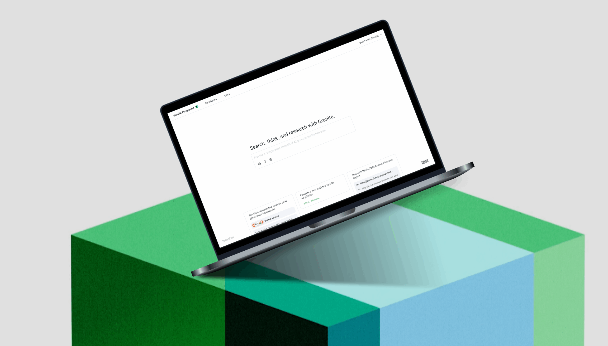
Granite 4 Agentic Playground —
Multi-Agent UX Redesign
Designing cohesive agent trajectories and outputs to showcase AI intelligence — from concept to polished, high-engagement launch.

To comply with my non-disclosure agreement, I have omitted and obfuscated confidential information in this case study. Information in this case study is my own and does not necessarily reflect the views of IBM.
Scope
Redesigned the Granite Model Playground from a single-model chat experience into an Agentic Playground that showcases the model’s capabilities beyond chat — including Searching, Thinking, and Researching.
My Role
Core UIUX Designer — owned the design of agent trajectories and input/output message frameworks across four agent mode, ensuring a cohesive, scalable, and responsive experience. Collaborated closely with PMs & engineers & other designers to uphold design quality and introduced micro-interactions that refined onboarding touchpoints
Duration
3 months (July–September 2025) — from early concept, design iteration, QA, to successful public launch.
Impacts
- 2.6× increase in daily prompts (692 → 1,827, peak 3,601)
- 3× increase in daily users (177 → 529)
- 175K+ downloads on Hugging Face
- Successfully scaled to support 18K prompts/day post-launch.
Project Introduction
What's project context
The original Granite Playground was built for a single-model paradigm.
When IBM released Granite 4 with new multi-agent capabilities — Search, Think, Research — the old UI could no longer express the system’s intelligence or the complexity of agent reasoning.
The challenge:
Design a unified playground that clearly communicates how different agents think, act, and produce results — without overwhelming users or slowing them down.
My role:
Lead the end-to-end interaction model redesign, including:
- agent trajectories
- interaction patterns & message formats
- onboarding and discoverability
- responsive structure
- process logs and output representation
This project required balancing speed, technical constraints, and future scalability while building a new experience and a new underlying capability in parallel.

OPPORTUNITY
How might we reveal the Granite model’s new agentic intelligence in a way that feels intuitive, learnable, and trustworthy — while staying lightweight and scalable for future agents?
How We Worked
To move quickly under an aggressive timeline, we adpoted a 3-in-a-Box co-design model across PM, engineering, and design.
This wasn’t a handoff pipeline — it was a true joint decision-making loop.
We collaborated through:
Bi-weekly sprints to prioritize what shipped now vs. next
3×/week topic deep-dives on complex problems
Daily stand-ups in the final weeks to unblock quickly
Dedicated Slack + Figma threads for tight async alignment
Many of the hardest trade-offs surfaced in these discussions. My influence was often in framing the design risks clearly enough that the team could make fast, high-quality decisions.

This tight feedback loop was essential, because we were designing and building the new agent capability in parallel while shipping on an aggressive timeline. Many of the most important trade-offs were surfaced, debated, and resolved through this collaboration.
Understanding the Users
Before designing anything, I needed clarity on who we were designing for and what they needed to accomplish.
Our two primary audiences:
- Developers — want to test, inspect output structures, evaluate reasoning, and understand model reliability.
- Engagement managers — want to showcase capabilities, demo reasoning, and build trust with clients.
I mapped their journey across:
Discover → Explore → Deep Dive → Trust → Feedback

From this, I identified the five core design areas that would structure the entire product:
- Onboarding / Entry Points
- Agent Selection & Mode Switching
- Interaction Flows
- Output Representation & Logs
- Feedback Module
These became the backbone of every decision — keeping the experience coherent instead of feature-layered.
Design Exploration
In this design exploration, I led the end-to-end UX strategy for introducing multi-agent capabilities into Granite. The goal was to make powerful new agent modes—such as Research, Think, and Search—intuitive and approachable while keeping the overall experience lightweight, consistent, and technically feasible.
Across the project, I balanced scalability, discoverability, and implementation constraints through iterative design, competitive analysis, and close collaboration with PM, engineering, and branding teams. My work focused on three key challenges:
Revealing multiple agents without overwhelming the UI,
Helping users understand and effectively leverage different agents, and
Ensuring consistent, high-quality interaction patterns across all modes and devices.
The resulting designs introduced clearer navigation, more intuitive agent switching, refined interaction flows, and a reusable logging pattern now adopted across IBM Research’s agent design system. These decisions created a cohesive, responsive, and scalable multi-agent experience that supports both current capabilities and future agent expansion.
Challenge 1 — How do we reveal multiple agents without making the UI feel complex?
Entry Point
For navigation entry point, I explored two navigation patterns:
Alt 1
A side-panel list-based model selector (better for scalability, customizable UIs)

Alt 2
An inline toggle embedded in the input (lighter, more visible, fewer navigation steps)

The Trade-off
There may be more agents added in the coming months, which is an advantage of the first approach; however, it would require more engineering effort and make navigation and discovery more complicated.

The Decision
I recommended the inline toggle as It met the timeline, made agent switching effortless, and allowed us to progressively add new agent modes with minimal development effort.
Agent Selection & Mode Switching
To improve interaction efficiency, I led a comparative analysis of competitors’ agentic UIs and our own capabilities.

Initial Design
Chat is placed at the same information level as “think””search ” and “research”.

Iteration
Chat as the default interaction mode while keeping others easily accessible within the input box.

The Decision
Based on the findings, I recommended setting Chat as the default interaction mode while keeping Think, Search, and Research easily accessible within the input box—simplifying the information architecture and minimizing user effort.
Onboarding
I explored several micro-interaction patterns to help users quickly discover and learn new agent capabilities directly from the landing page, while maintaining a clean and minimal design.
The options included the following:
Idea 1:
Welcome Message Text Animation Variation

Idea 2:
InputBox Placeholder Animation Variation

Idea 3:
Auto-select agent mode instead of manually

Idea 4:
Convert placeholder sample prompt into input

The Trade-off & Considerations
- The welcome-message animation required alignment with Granite branding to ensure the color, motion style, and blue–green visual language were consistent.
- Converting sample prompts into actual input text seemed appealing but added unnecessary interaction and backend complexity.
- Auto-selecting an agent mode, however, clearly surfaced new agent types and improved discoverability without adding cognitive load.

The Decision
We coordinated with the branding team to refine the text animation to match Granite’s visual guidelines, introduced a simplified placeholder animation, and enabled auto-selection of the default agent. I also partnered with designers to integrate the latest sample-prompt patterns and worked with engineering to fine-tune animation timing. This solution balanced clarity, discoverability, and technical feasibility — keeping the landing experience minimal while guiding users toward new agent capabilities
Challenge 2: How do we help users leverage different agents effectively?
Agent Interaction: Analysis
To understand how users could better leverage agents, I began with the Research agent — the highest-priority agent for showcasing Granite 4’s deep-research capabilities and its complex retrieve → reason → synthesize workflow. I quickly analyzed competitors, reviewed relevant literature, and examined log data. These insights clarified user needs, informed the flow, and guided my design exploration
Competitor Analysis

Agent Interaction Flow

Agent Process Log Data Analysis

Agent Interaction: User Flow Design Exploration
To help users better leverage the Research agent, I prioritized key design ideas, refined the user flow, and explored two layout patterns for progress logs: inline vs. a sidebar.

The Trade-off & Consideration
Option 1 – Pros: Preserved conversational flow and worked within technical constraints. Cons: Required strong hierarchy and progressive disclosure to prevent visual noise.
Option 2 – Pros: Very clear structure. Cons: Felt heavy and caused a split-attention problem
The Decision
After aligning with PM, engineering, and design partners, I advocated for and secured the new agent capability on the roadmap, and chose the inline model with progressive disclosure—improving user clarity, reducing implementation complexity, and keeping the sidebar free for future use.
Agent Interaction: Process Log Design
One of the most challenging UX problems involved the Research Agent’s process log.
The logs were technically accurate but visually overwhelming, and our existing trajectory components didn’t fit the use case.
The Trade-off
I found a reusable trajectory pattern designed for ReACT-style agents, but applying it directly caused overly long, screen-filling steps and a mismatched data structure, so I partnered with engineering to rethink log structure and display.

Iterated Design Prototype

The Decisions
I partnered with engineering to restructure logs: applied consistent Markdown styling, placed logs before output for logical reading, and added a min-height container with the latest step anchored. This improved pattern was adopted into the IBM Research agent design system, enabling more flexible trajectory designs for different agent types.
Log Structure
Stream logs within a max-height container, displaying the latest step at the bottom in a clear, Markdown-style hierarchy.

Log Placement
Move inline logs above the output and rename it from “How did I get answer” to “Research Activity” to minimize user confusion.

Agent Mode Switch
Since users often follow up rather than start new research, we defaulted to Chat mode and disabled the Research toggle to prevent accidental long runs.

Challenge 3 — How do we Ensured high-quality, consistent implementation across all experiences?
Agent Interaction: Consistency
To help users understand differences between agents while quickly learning interaction patterns, I designed consistent interaction patterns across all agents.

"Think" Agent Prototype

"Search" Agent Prototype

Output Representation Quality
I worked closely with both agent developers and front-end developers to create and implement visual guidelines that ensure a high-quality visual representation of the product. These guidelines were later adopted and reused by the IBM Research agent design system and multiple other IBM Research projects.

Agent Interaction Responsiveness
With 70% of usage on desktop and 30% on mobile, I created a clear responsive design spec with breakpoints aligned to the IBM Carbon grid and major device sizes. I also defined a flexible landing-page layout to ensure consistent, responsive behavior across all primary screens.

Outcomes & Impacts
The Granite Playground launched on schedule and drove significant impact—2.6× daily prompt growth, a 3× increase in user sessions, and over 175K model downloads—marking the highest engagement in Granite’s launch history.

What I Learned & What I’d Improve
What I learned
Designing for agentic-AI systems means designing behaviors, not screens.
I learned that the real UX challenges live in the reasoning patterns, handoffs, and cognitive workflows behind the UI. My job wasn’t just arranging surfaces—it was about choreographing how the underlying agentic workflow thinks, responds, and reveals its intelligence
Logs aren’t “developer output”—they’re trust signals.
I came to understand logs as the narrative of the model’s mind. How they’re structured and revealed directly shapes credibility. Clear logs are not a nice-to-have—they’re essential for trust in AI systems.
The right design is often the one that aligns with engineering reality.
Working in parallel with a model still being built taught me to time ambition wisely. Sometimes the best contribution is delivering a simplified pattern that unblocks the team while still moving the experience forward.
What I’d Improve With Hindsight
Push earlier for user research on agent workflows.
I would start research sooner around how users understand the retrieve → reason → synthesize loop. Earlier validation of the Research agent’s logs would have helped us tighten structure, clarify phrasing, and reduce noise sooner.
Introduce more intuitive controls for agent depth and autonomy.
With more time, I would explore a unified control model for:
Think vs. Chat → reasoning depth
Search vs. Research → search depth + synthesis
A clearer mental model here would reduce cognitive load and help users pick the right agent behavior more confidently.
A Battle I Lost
I proposed a hierarchical trajectory component that grouped steps into meaningful stages, enabling fast high-level scanning. Engineering blocked it due to timeline—and they were right.
We shipped a refined Markdown-based structure instead. It wasn’t my dream solution, but it unblocked progress, improved clarity, and later became a foundation for trajectory standards across the design system. It taught me that “better now” can be more valuable than “perfect later.”
A Battle I Chose Not to Fight
I intentionally didn’t escalate a redesign of the entire sidebar architecture to accommodate future non-chat interactions. With major agent expansion still months away, pushing for structural change too early would have delayed the release and wasted alignment capital.
Saving that battle kept us focused on delivering the right value at the right time.
Reflections
This project pushed me to balance technical constraints, model complexity, and user-centered design at scale.
It strengthened my ability to advocate for clarity in agent interactions, negotiate difficult trade-offs across teams, and shape a coherent experience that communicates the intelligence of a multi-agent model.
Ultimately, it reinforced something I carry into every AI project now:
Great AI UX isn’t just about UI—it’s about making reasoning understandable, trustworthy, and delightful.
MY PORTFOLIO
- All
- Case Study
- AI
- AR/VR
- Other